It’s really hard to make meaningful comparisons of income over time. There’s the obvious issue of inflation and deflation—people have more dollars now but each dollar buys less of lots of things (e.g., housing and food) though more of others (e.g., technology). The usual fix is to use the Consumer Price Index (CPI) or something similar to adjust incomes for purchasing power across a basket of goods and services.
But other important factors keep changing as well. We often hear about long-term trends in median household income, yet we don’t have the same households as we did a few decades ago. According to U.S. General Social Survey (GSS) data, for example, the typical household had 3.3 people in the 1970s compared with only 2.5 in the early 2010s. Flat household incomes would actually imply rising living standards given shrinking households. And household incomes are particularly tricky to measure consistently given changes in the tax code, spousal support, governmental cash benefits, governmental non-cash benefits, and so on.
Even just trying to compare individuals’ earnings from work over time is remarkably challenging. Some patterns imply higher personal incomes. For instance, folks with 4-year college degrees tend to make a lot more than folks without them, and the percentage of full-time workers with 4-year degrees basically doubled from around 18% in the 1970s to around 36% in the early 2010s. Older workers tend to make more money than younger ones, and the average age of full-time workers has increased by a few years over the past decades. People working longer hours make more, and full-time workers have been working a couple/few more hours on average (though this trend was interrupted by the Great Recession).
On the other hand, some worker trends imply lower personal incomes. Whites tend to make more than non-whites, and the percentage of the full-time workforce that is non-Hispanic white has declined from around 85% in the 1970s to around 66% in the early 2010s. Men tend to make more than women, and the percentage of the full-time workforce that is male has declined from around two-thirds in the 1970s to just over half in the early 2010s.
So what’s really going on with income trends? Here, I look at the basic question of how pre-tax, CPI-adjusted, personal cash incomes from full-time workers have changed over time, taking into account education, gender, race, hours worked, and age. What groups of full-time workers have seen incomes decline or rise over the past 40 years?
I used GSS data from 1972 to 2014. I took their CPI-adjusted personal income item, adjusted it further into 2016 dollars, and capped it at $250k (otherwise it has some big outliers). I then examined the role of education, gender, race, hours worked, and age, including looking for ways in which the links between these factors and income have changed over time.
Here’s the big picture. The full-time income gap based on race hasn’t moved much. The gap between men and women has shrunk. The gap between the college-degreed and the less-educated has grown. The gap between those working longer and shorter full-time hours has grown. The gap between older and younger workers has grown. Add all these together and some groups on average have had substantially declining incomes over the past 40 years (e.g., less-educated men who don’t work long hours), while others have had substantially rising incomes (e.g., older degreed women who work long hours).
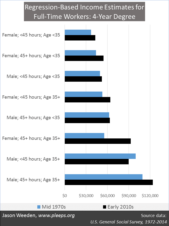
The charts below show regression-based income estimates for various groups of full-time workers, broken down by whether they have 4-year degrees or not, whether they’re male or female, whether they work longer hours or not, and whether they’re younger or older. Using regression-based procedures allows estimates that assume constant values for race (so, all the reported group numbers assume the same racial composition), education (so, all the numbers for degreed folks assume the same rates of graduate education and for non-degreed folks assume the same rates of high-school graduation and college attendance), hours worked (so, all 45+ hour groups assume the same number of hours worked and all <45 hour groups assume the same number of hours worked), and age (so, all 35+ groups assume the same age composition and all <35 groups assume the same age composition). This is as close as I can come to making this an apples-to-apples comparison—looking at how similarly situated workers have had changing real incomes over time. I put the various groups into two charts, the first for degreed workers and the second for non-degreed workers.
 (Technical notes: The sample size is 7,405. Results are weighted.)
The big stand-out in the chart above is degreed women who work 45+ hours and are 35 or older. For this group, plugging in various constant values as I described above, those in the mid-1970s were making around $55k (in 2016 dollars), while those in the early 2010s were making around $93k. That’s just a really big deal. Other groups of degreed women have also seen rising incomes, though more modestly, increasing around $10k from the mid-1970s to the early 2010s. Degreed men, though, have generally had relatively flat incomes on this apples-to-apples comparison, with the exception of those who both work longer hours and are older, whose incomes increased by around $14k. Overall, the news has been good for degreed full-time workers.
The next chart is non-degreed workers. Here, overall, it’s not good news. Most groups have had declining incomes on an apples-to-apples comparison. It’s been particularly bad for non-degreed men, especially for those who don’t work long hours—at ages 35 and older, incomes declined from around $65k in the mid-1970s to around $47k in the early 2010s, and for those younger than 35 the decline was from around $43k to $29k. Longer-hour-working younger men also declined from around $48k to $37k. In other words, these are all groups that lost around a quarter of their former incomes. There was only one non-degreed group that showed a meaningful gain in income—older women who work longer hours, who went from around $40k to $47k from the mid-1970s to the early 2010s.
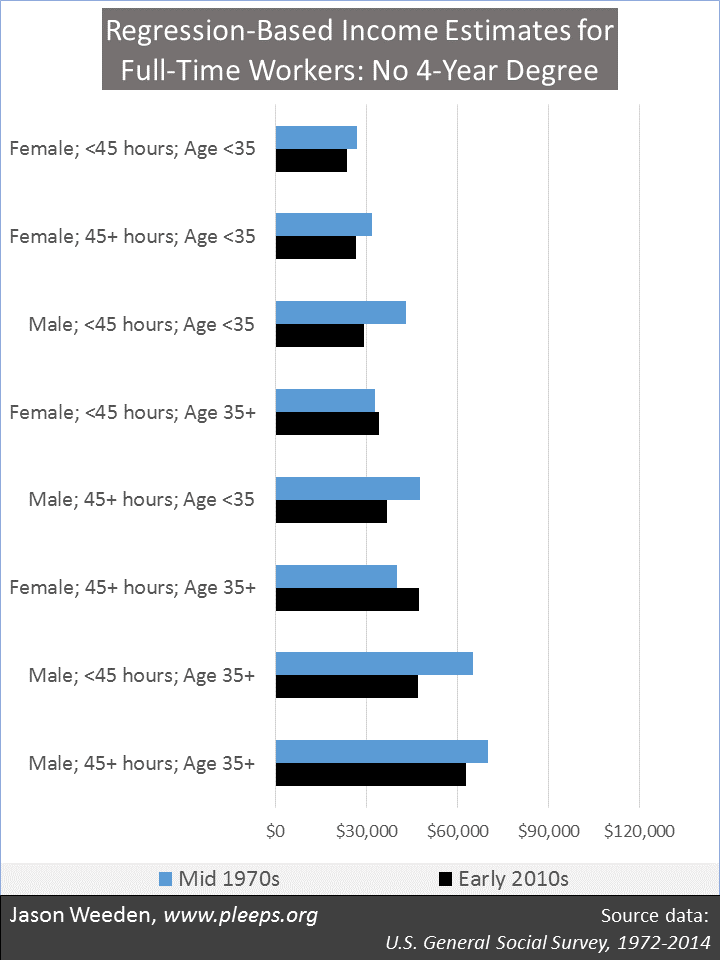 (Technical notes: The sample size is 18,381. Results are weighted.)
So many pieces to these puzzles
Several important social trends interact with these changes in income. More women and fewer men, and more older people and fewer younger people, are working in the first place—both trends that are probably related to changes in incentives from available incomes. More young people (especially non-degreed young people) are living with their parents—something probably related to higher work rates and incomes for older women combined with declining work rates and incomes among younger folks.
Marriage has been declining, particularly among the less educated—male income levels probably are in part a cause and in part an effect here. And fertility has been declining—something probably related simultaneously to declining marriage rates, reduced male work and incomes, and, most obviously, higher female education and work rates and incomes.
This says something about how hard these issues—incomes, work rates, education, living arrangements, marriage, fertility, etc.—are to analyze. It’s just a ridiculously complicated array of interconnected and constantly changing social patterns. Any analysis too simple will be laughably incomplete; anything too in depth won’t be understandable to non-cyborgs. Pity the social scientist.
Clinton’s high-education women vs. Trump’s low-education men
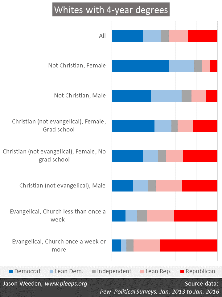
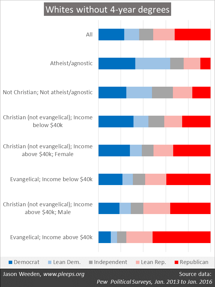
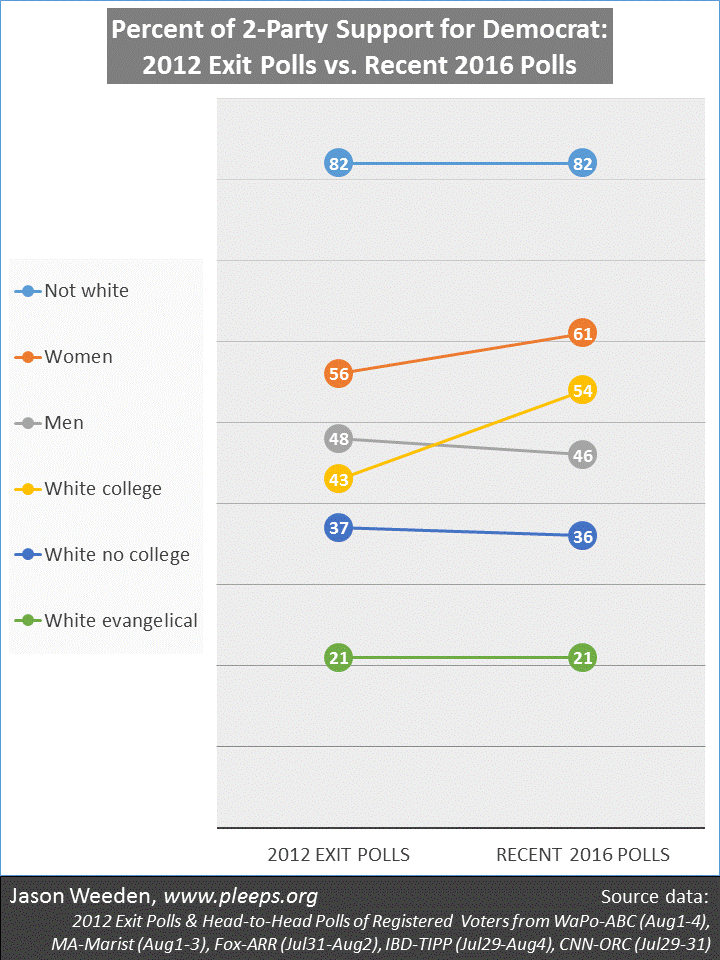
You can’t look at the income charts above without thinking of the current presidential election. The big story this year appears to be that Clinton is drawing particularly increased support from college-educated white women while Trump is disproportionately holding non-degreed white men. The former are among the biggest winners from income changes in the last few decades while the latter are among the biggest losers.
It’s a reminder that Trump’s message of making America “great” “again” isn’t just about race, religion, and gender, but education as well. In a time that has not yet passed from living memory, older non-degreed men were able to work a 40 hour week and make pretty good money. Their non-degreed sons and grandsons face a very different world. Those of us who are generally on the winning side of recent trends might rightly oppose Trump and his positions, yet this doesn’t mean we shouldn’t be aware of the genuinely disorienting decline in the relative social position of his supporters. Trump will probably lose this election, but the social realities propelling his candidacy will remain.

